
Color affects purchase decisions before consumers read product details. For custom rigid boxes, the right palette quickly communicates luxury, freshness, romance, sustainability, or gift value.
This checklist help brands match colors with product positioning, consumers, box structures, and finishes like foil stamping, embossing, Spot UV, matte, and soft-touch coating.
Why Color Psychology Matters in Custom Rigid Box Packaging?
Color psychology helps packaging guide emotion, not just look attractive. Black suggests luxury, white feels clean, pink feels romantic, green feels natural, and red creates festive desire.
Color should match product type, box structure, finish, and price positioning. Clear emotional direction makes custom rigid box design persuasive.
Reference Table
| Color | Emotion | Suitable Products | Finishes |
| Black | Luxury, Mystery, Premium | Perfume, Jewelry, Electronics | Gold Foil, Soft Touch |
| White | Clean, Pure, Trust | Skincare, Cosmetics, Wellness | Embossing, Spot UV |
| Red | Passion, Celebration, Desire | Chocolate, Gifts, Perfume | Gold Foil, Matte |
| Pink | Beauty, Romance, Softness | Cosmetics, Jewelry, Candles | Rose Gold, Soft Touch |
| Blue | Trust, Calm, Freshness | Skincare, Electronics, Gifts | Silver Foil, Spot UV |
| Green | Natural, Healthy, Sustainable | Wellness, Tea, Organic Products | Kraft, Debossing |
| Brown/Kraft | Warm, Organic, Handmade | Coffee, Candles, Soaps | Texture, Ribbon |
| Purple | Mystery, Creativity, Elegance | Perfume, Candles, Jewelry | Gold Foil, Matte |
| Yellow/Orange | Warmth, Energy, Appetite | Food, Cookies, Kids’ Products | Kraft, Gold |
| Metallic | Luxury, Shine, Value | Premium Gifts, Perfume, Jewelry | Foil Stamping |
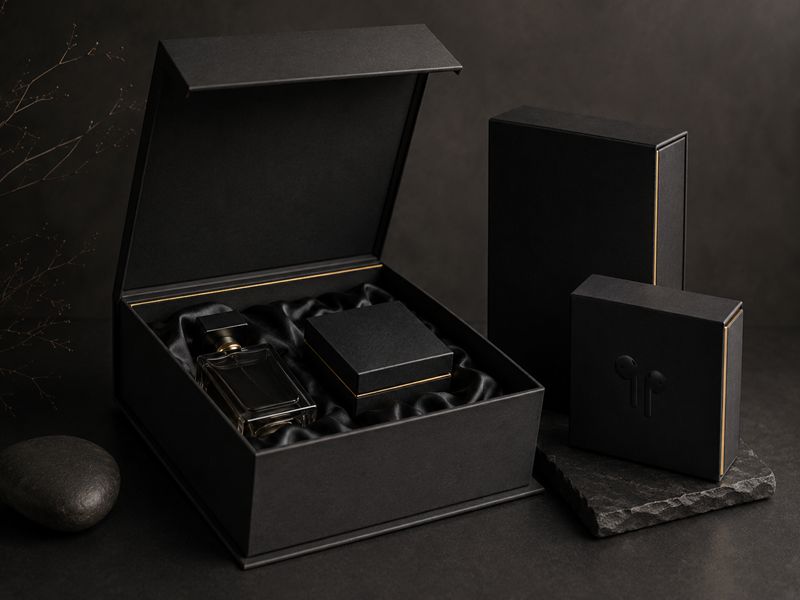
Black Color Palette
Black creates a premium, mysterious, and exclusive feeling. It suits perfumes, jewelry, watches, candles, electronics, and luxury gift sets.
Style Keywords:
- Luxury
- Mystery
- Premium
Use it with magnetic boxes, drawer boxes, or shoulder neck boxes. Gold foil, silver foil, embossing, debossing, or soft-touch coating can further increase perceived value.
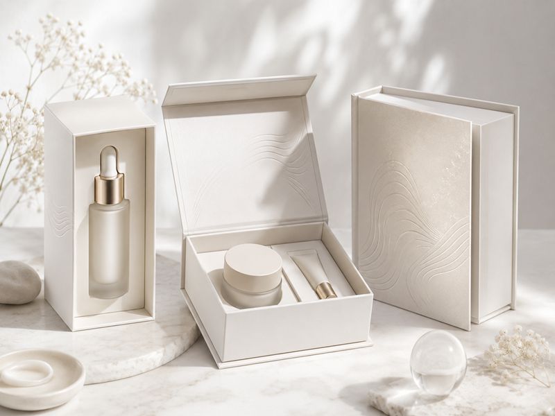
White Color Palette
White communicates cleanliness, purity, simplicity, and trust. It is ideal for skincare, cosmetics, wellness, baby products, perfume, and minimalist lifestyle packaging.
Style Keywords:
- Clean
- Pure
- Trust
White is commonly used for shoulder neck, hinged lid, and book-style box designs. Pair it with gold, silver, soft pink, sage green, embossing, or Spot UV.
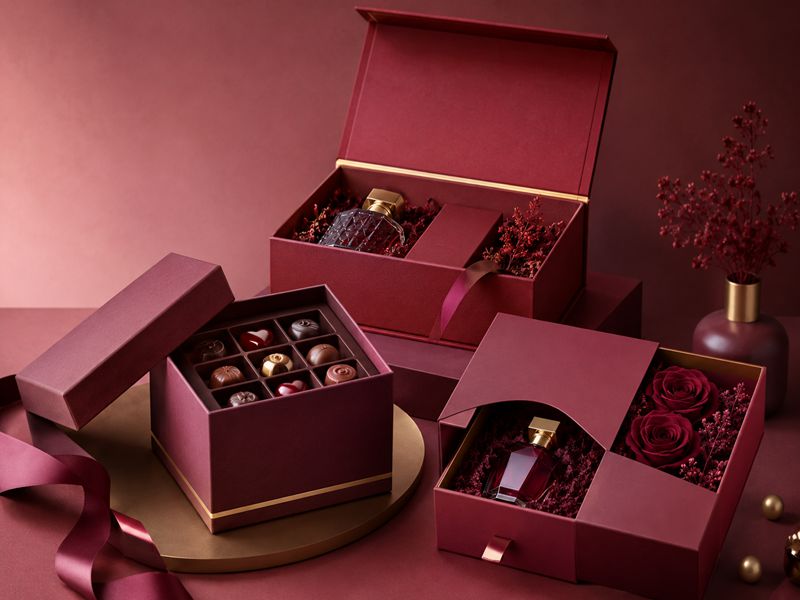
Red Color Palette
Red attracts attention quickly and creates passion, warmth, celebration, and strong buying desire. It is suitable for chocolates, perfumes, cosmetics, holiday gifts, jewelry, and limited editions.
Style Keywords:
- Passion
- Celebration
- Desire
Use red with two piece boxes, drawer boxes, or hinged lid boxes. Burgundy, wine red, matte red, and gold foil make packaging more premium.
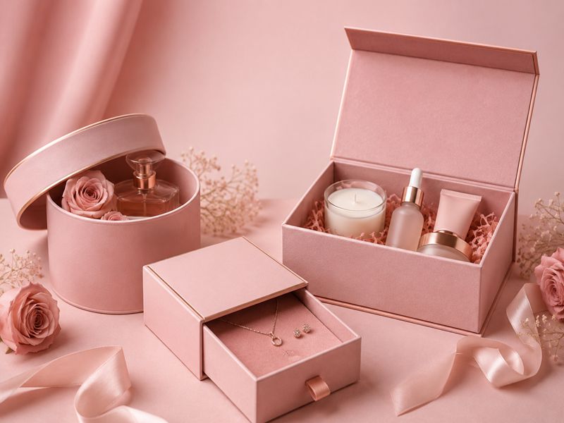
Pink Color Palette
Pink feels beautiful, romantic, soft, and emotionally warm. It works well for cosmetics, skincare, perfume, jewelry, candles, chocolate, and gift packaging.
Style Keywords:
- Beauty
- Romance
- Softness
Blush pink feels premium, dusty rose feels elegant, and bright pink feels fashionable. Pair pink with gold foil, rose gold foil, white embossing, or soft-touch coating.
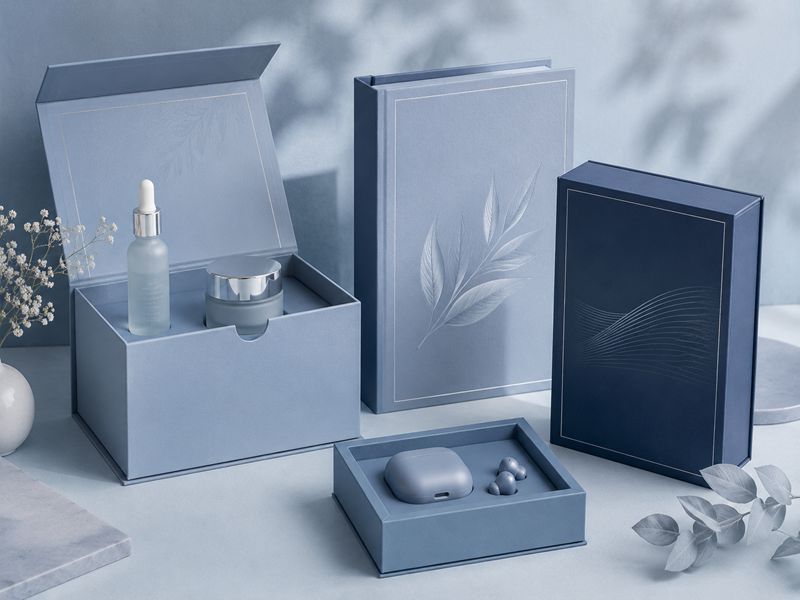
Blue Color Palette
Blue communicates trust, calmness, freshness, and professionalism. It is suitable for skincare, wellness, fragrance, personal care, electronics, stationery, and lifestyle products.
Style Keywords:
- Trust
- Calm
- Freshness
Light blue feels clean and gentle, while navy feels stable and premium. Use blue with magnetic boxes, book style boxes, silver foil, white embossing, or Spot UV.
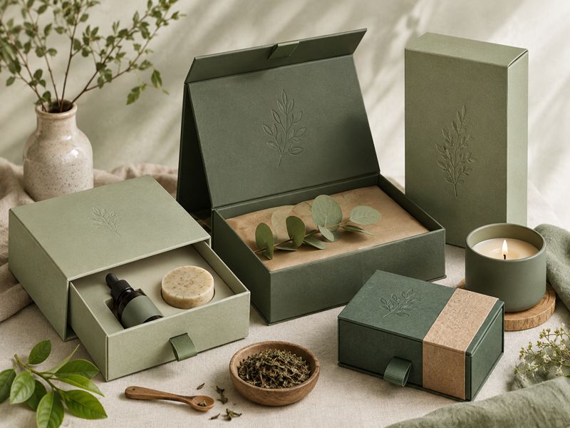
Green Color Palette
Green suggests nature, health, balance, freshness, and sustainability. It is ideal for skincare, aromatherapy, candles, tea, organic products, wellness gifts, and eco-conscious packaging.
Style Keywords:
- Natural
- Healthy
- Sustainable
Sage green feels calm, olive feels earthy, and forest green feels premium. Pair green with kraft paper, beige, gold foil, matte coating, or debossing.
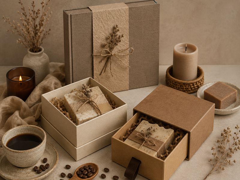
Brown and Kraft Color Palette
Brown, kraft, beige, and earthy tones create a natural, handmade, warm, and honest impression. They suit candles, tea, coffee, chocolate, handmade cosmetics, natural soaps, and organic skincare.
Style Keywords:
- Organic
- Warm
- Handmade
Use kraft drawer boxes, beige two piece boxes, or textured book style boxes. Embossing, debossing, ribbon, and foil details improve value.
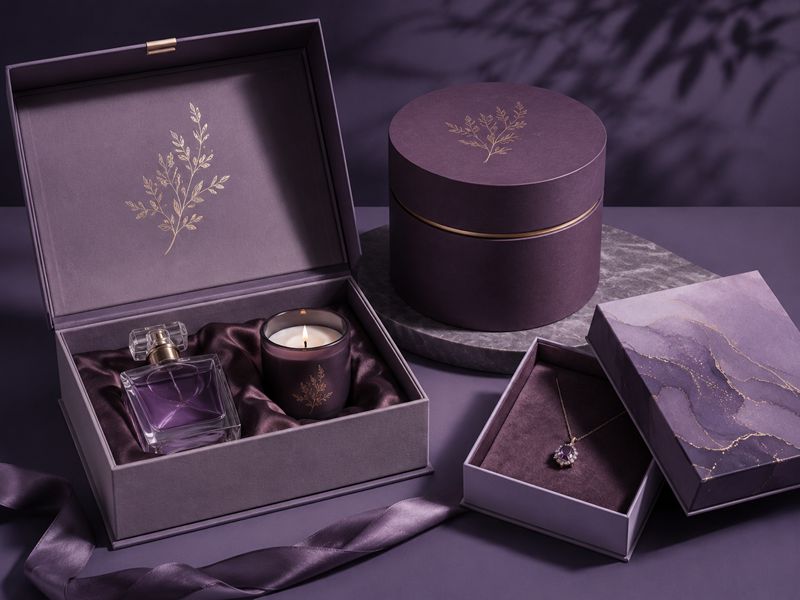
Purple Color Palette
Purple expresses creativity, mystery, beauty, and premium emotion. It suits perfumes, cosmetics, candles, chocolates, jewelry, spiritual wellness products, artistic gifts, and limited editions.
Style Keywords:
- Mystery
- Creativity
- Elegance
Deep purple feels luxurious, lavender feels soft, and plum feels mature. Use purple with magnetic boxes, round boxes, gold foil, silver foil, or Spot UV.
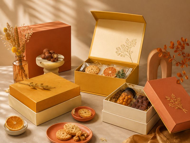
Yellow and Orange Color Palette
Yellow and orange create warmth, optimism, energy, friendliness, and appetite appeal. They are suitable for food gifts, chocolates, cookies, children’s products, candles, festive packaging, and playful cosmetics.
Style Keywords:
- Warmth
- Energy
- Appetite
Mustard yellow feels stylish, terracotta feels natural, and amber feels premium. Pair them with cream, kraft, brown, gold, or black.
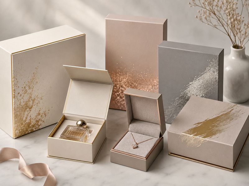
Metallic Colors
Metallic colors add shine, luxury, and stronger shelf appeal. Gold feels warm and valuable, silver feels modern and clean, rose gold feels fashionable, and champagne feels refined.
Style Keywords:
- Luxury
- Shine
- Value
Use metallic effects for logos, borders, patterns, ribbons, and limited-edition details. Keep decoration balanced to avoid a busy or less premium look.
Match Color Palette with Rigid Box Structure
Rigid box structure affects how consumers experience color during unboxing. Different structures create different visual layers, opening methods, and product displays.
By matching color direction with box style, brands can strengthen premium feeling, gift appeal, brand recognition, and the emotional impact of the first impression.
Reference Table
| Structure | Color Direction | Effect |
| Magnetic Box | Black, Navy, Gold | Premium |
| Drawer Box | Contrast Colors | Reveal Effect |
| Shoulder Neck Box | Main + Inner Color | Layered |
| Hinged Lid Box | Soft / Luxury Tones | Gift-Ready |
| Book Style Box | Brand Colors | Display-Focused |
| Round Box | Pastels, Cream | Soft |
| Collapsible Box | Brand Colors | Practical |
Colors should match the rigid box structure to strengthen visual impact.
Match Color Palette with Surface Finishing
Surface finishing changes how colors look, feel, and reflect light. Finishing techniques such as matte, gloss, soft touch, foil stamping, embossing, debossing, and Spot UV help colors create stronger visual depth, tactile appeal, and emotional connection with consumers.
The right finish makes packaging more tactile, refined, memorable, and persuasive for consumer buying decisions.
Reference Table
| Finish | Effect | Use |
| Matte | Calm, Premium | Luxury Boxes |
| Gloss | Bright, Eye-Catching | Retail Packaging |
| Soft Touch | Smooth, Refined | Beauty / Jewelry |
| Foil | Shiny, Valuable | Logos |
| Embossing | Raised Texture | Brand Highlight |
| Debossing | Subtle Depth | Minimal Luxury |
| Spot UV | Gloss Contrast | Patterns / Logos |
Surface finishing changes how consumers feel about colors.
Color Checklist by Product Category
Each product category needs a color palette that matches consumer expectations and buying emotions. Beauty products need softness, skincare needs cleanliness, perfume needs luxury, and food gifts need appetite appeal.
Choosing colors by category helps packaging communicate value faster and increase purchase desire.
Reference Table
| Product | Colors | Feeling |
| Cosmetics | Pink, White, Rose Gold | Beauty |
| Skincare | White, Blue, Green | Clean |
| Perfume | Black, Purple, Gold | Luxury |
| Candles | Cream, Kraft, Brown | Warm |
| Chocolate | Brown, Red, Gold | Indulgent |
| Jewelry | Black, White, Gold | Premium |
| Electronics | Black, Silver, Blue | Modern |
| Baby Products | Cream, Soft Blue, Pink | Gentle |
| Gift Sets | Red, Gold, Champagne | Festive |
Different products need different emotional color directions.
Common Color Mistakes to Avoid
Do not choose colors only because they look beautiful. Each palette should match the product category, price level, audience, and buying occasion.
Avoid too many colors, unbalanced metallic finishes, and copied competitor styles. Also consider inner tray, insert, ribbon, and lining colors. Always test colors on real paper, coating, and finishing samples before mass production.
How to Choose the Right Color Palette Before Custom Production?
Start with product positioning. Luxury products suit black, navy, burgundy, gold, and champagne. Natural products fit sage green, kraft, beige, and earth tones. Beauty products work well with pink, nude, lavender, and rose gold.
Then decide where colors appear: outer paper, tray, sleeve, lid, neck, insert, ribbon, logo, or pattern. Match them with matte, gloss, soft-touch, foil, embossing, or debossing.
Step Keywords:
- Define Product Positioning
- Match Color Direction
- Decide Color Placement
- Select Surface Finish
- Check Brand Consistency