
Seasonal gift box design can give the same box format a different story by changing a few expressive surfaces while retaining a recognizable identity. A printed band can announce the season, an insert card can explain the occasion, and a repeated motif can connect the outside to the opening. The strongest result feels like a new chapter in the same collection rather than an unrelated package wearing a familiar logo.
This approach is especially useful when the gift itself remains recognizable across the year. The design challenge is to make each edition distinct without asking every surface to change at once. Seasonal character can come from rhythm, imagery, and language as much as from the expected colors of a holiday.
What Stays Constant, and What Carries the Season?
Keep the elements that establish identity consistent, and give seasonal expression a clearly defined place. A familiar box color, wordmark position, or proportion can serve as the anchor. The band and card can then introduce a different visual mood without obscuring the underlying design.
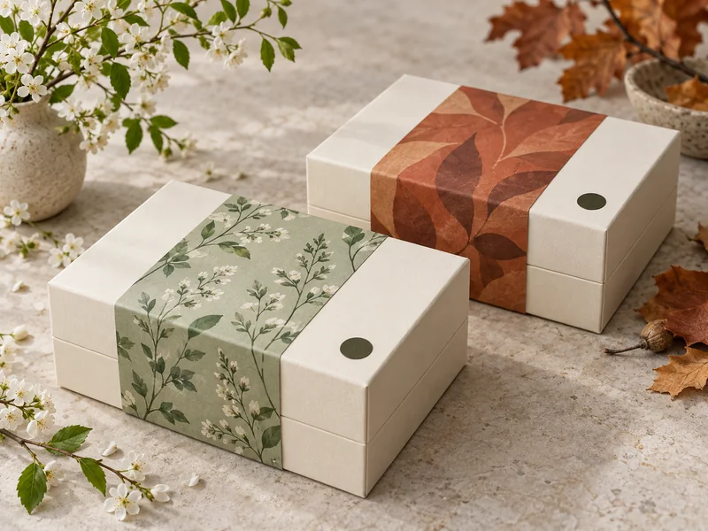
For a fictional collection, imagine a warm ivory box with a small dark emblem near one corner. A spring band might use an open botanical drawing, while an autumn version uses a denser arrangement of abstract shapes. Both remain recognizable because the box and the placement of its main identifying element continue to agree.
A two-piece rigid box provides a lid and base whose visible relationship can remain consistent between editions. A seasonal wrap can cross the lid, provided it does not conceal the opening or important information. The underlying construction should still be understandable after the wrap is removed.
| Design Layer | Role Across Seasonal Editions |
| Main Box | Hold the recognizable identity and overall proportions |
| Removable Band | Introduce the season through a focused graphic statement |
| Insert Card | Explain the occasion and add a personal message |
| Interior Accent | Connect the reveal to one detail from the exterior |
The Band: A Small Surface With a Clear Job
Give It One Dominant Message
A band works well when the reader can immediately tell what it adds to the box. That might be a seasonal illustration, a brief edition name, or a personal greeting. On a narrow band, let the edition name occupy the clearest reading area, reduce the illustration to a supporting detail, and move a longer greeting onto the card; this gives each element enough room to do its job at the moment it is encountered.
Let the main box continue to carry the stable identity while the band supplies the temporary voice. A generous area of unprinted paper can separate those two roles. The band does not need to cover most of the lid to make the edition feel different.
The site’s guide to gift box belly band styles describes several ways a band can contribute to presentation. Here, the more useful creative question is what the seasonal band says, and how that message changes from one edition to the next. Structure and decoration should support that purpose together.
Design the Removal Into the Story
Think about what remains visible when the band slides away. A small motif beneath it can become a second moment of recognition, or the plain box can provide a calm pause before opening. Avoid placing the only product identity or essential instruction on a piece likely to be discarded.
The join and overlapping area also influence the graphic arrangement. Keep important words away from folds or interruptions that make them harder to read. A continuous pattern can be attractive, but a deliberate quiet area may offer a clearer place for the band to meet.
The Card: Turn a Seasonal Look Into an Occasion
What does the card contribute that the exterior cannot? It can explain why this particular gift belongs to the moment, in language that feels more personal than a display surface. The exterior catches attention; the card provides context once the recipient has chosen to open the box.
Write for the Recipient’s Moment
A spring message might invite someone to notice a small beginning, while an autumn message might suggest sharing something made or remembered. These are possible creative directions, not meanings every recipient will attach to the season. The words should suit the actual audience and the gift inside.
Keep the message short enough to read without searching for its main point. A greeting, a sentence connecting the occasion to the contents, and a space for a personal note can be sufficient. If detailed product guidance is needed, give it a clearly separate area.
The ideas in printed insert cards for luxury gift boxes help define that information hierarchy. A seasonal card should add something meaningful beyond the phrase already printed on the band. Repeating every graphic and line of copy would make the opening feel less like a continuation.
Leave Room for a Human Contribution
A blank writing area can make the same design appropriate for different relationships. Keep it free from dense patterns and finishes that interfere with the intended writing tool. The personal note may become the most specific part of the gift, so it deserves a usable space rather than a decorative corner.
An optional card also allows a collection to acknowledge an occasion without forcing a particular greeting onto every box. That distinction matters when a seasonal edition reaches recipients with different customs. Clear, welcoming language can leave room for several ways to celebrate or simply give thanks.
Color and Pattern: Suggest a Season Without a Costume
Seasonal identity does not require a checklist of familiar symbols. A lighter pattern density, a change in line weight, or a different balance of warm and cool accents can alter the mood while preserving the design’s character. The connection should be understandable without relying on exaggerated decoration.
The National Gallery of Art’s Elements of Art resource identifies color, line, shape, form, and texture as basic visual elements. Applying that vocabulary to packaging gives a designer several ways to vary an edition instead of changing only its color. The seasonal associations below are illustrative choices, not universal rules about what colors mean.
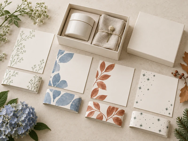
| Illustrative Direction | Possible Visual Treatment |
| Spring: New Beginnings | Open spacing, fine stems, and a restrained fresh accent |
| Summer: Shared Moments | Broad shapes, a relaxed repeat, and one brighter detail |
| Autumn: Gathering | Layered forms, warmer accents, and a more compact rhythm |
| Winter: Quiet Celebration | Clear contrast, small points of detail, and generous empty space |
These examples suit a particular four-season creative framework, not every climate or market. An edition intended for a different region may need another seasonal reference or an occasion-led theme. Start from the recipient’s context rather than assuming that snow, falling leaves, or spring flowers carry the same meaning everywhere.
Carry One Detail Through the Opening
The interior feels connected when it recalls one recognizable part of the exterior. A line from the band can reappear at the edge of the card, or an accent color can return in a ribbon. Repetition becomes more effective when the scale and placement change with the surface.
A book-style rigid box offers an attached inner lid that can hold a small continuation of the theme. For example, an exterior pattern might reduce to a single shape beside the greeting inside. The open view then feels related without becoming a duplicate of the closed box.
Texture can carry continuity even when the seasonal artwork changes substantially. Exploring rigid box wrapping materials can help define a consistent paper character for the collection. Avoid treating a natural-looking texture as proof of recyclability or another environmental attribute that has not been established.
Questions That Keep Seasonal Design Focused
Must Every Edition Use a Different Box Color?
No: a stable box color can make the changing band and card easier to recognize as related editions. Variation can come from illustration, spacing, or a small accent. Change the main color only when it adds something the smaller surfaces cannot express clearly.
Should the Band and Card Match Exactly?
They should feel related, but they can perform different jobs. The band may carry the largest motif while the card uses only a detail from it. Shared typography or color can connect them without requiring the same composition.
Can a Seasonal Box Still Feel Personal?
Yes, when the design leaves room for the recipient and the giver. A writable card, an adaptable greeting, and a story connected to the actual contents can make a seasonal edition feel specific. Decoration alone cannot supply that relationship.
A coherent seasonal collection keeps its identity easy to recognize while allowing each edition to express a distinct moment. Give the band a clear visual statement, the card a meaningful message, and the interior one familiar detail. The same box can then tell a changing story without losing the thread that connects the collection.