
A candle and diffuser gift box tells a shared story when its two products belong to the same occasion, use a recognisable visual language, and appear in an opening sequence that makes their relationship clear. The candle can mark a chosen moment, while the diffuser introduces another way to enjoy the collection. Packaging gives those different objects a common setting without disguising how each one is used.
The most useful starting point is a scene rather than a decorative finish: a housewarming, a quiet weekend, or a small thank-you gift. From that scene, the colour, arrangement and accompanying words can follow naturally. To explore how that process might work, this article imagines a garden-themed fragrance collection and its packaging, with hypothetical arrangements developed for explanation rather than photographs or results from a client commission.
What Makes Two Fragrance Products Feel Like One Gift?
A clear connection makes the set feel intentional: the recipient should understand why these particular objects arrived together. Matching fragrance names can provide that connection, but a shared place, season or mood can do the same work when the two scents differ.
Imagine a housewarming collection inspired by an open garden door. The candle might carry a green floral fragrance description, while the diffuser belongs to a complementary woody direction. A short message about bringing a little of the garden indoors explains the pairing without promising that everyone will experience the fragrances identically.
This narrative can begin with the formats already shown in Seven Rainbow’s custom rigid candle box collection, including combinations of a candle jar, diffuser bottle and reeds. The packaging structure supplies room for the objects; the editorial idea explains their relationship. Neither needs to carry the entire story alone.
Start With One Sentence the Recipient Can Remember
Write the central idea before naming individual panels or selecting ornaments. A sentence such as “A small garden welcome for your new home” gives the design a direction and leaves room for a personal note. It also makes it easier to remove decoration that belongs to a different mood.
- For a housewarming, connect the objects through a place or welcome.
- For a seasonal gift, use a specific detail such as orchard leaves or winter light.
- For a thank-you, leave the sender’s message more prominent than the collection story.
These are creative starting points, not claims about the effects of a fragrance. Words such as “garden,” “evening” and “welcome” can describe an imagined setting without suggesting a medical or emotional outcome.
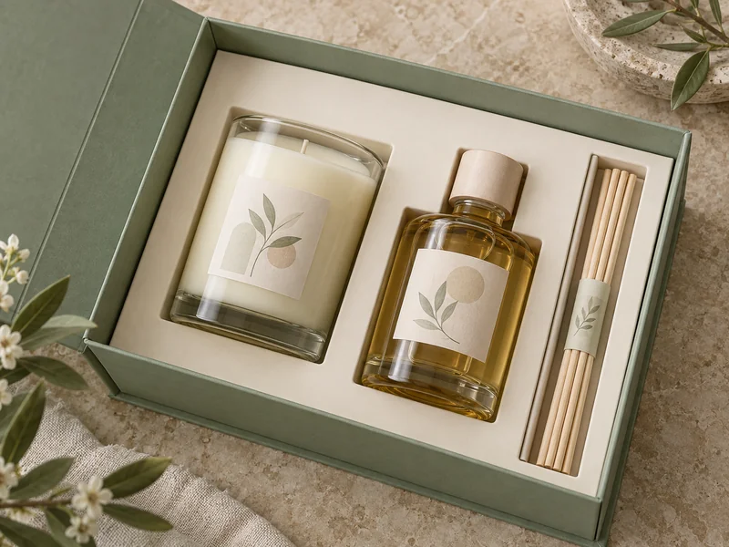
How Does the Story Unfold as the Box Opens?
Give each stage a different job: the closed box introduces the theme, the open lid explains the pairing, and the tray makes the contents easy to understand. This creates progression without requiring layers of paper or a long sequence of obstacles.
Before Opening: Establish the Setting
The outer surface can carry the collection name, one restrained motif and enough product information to identify the gift. A garden concept might use a muted green field and a small branch drawing. Covering every face with botanical artwork would leave less room for the quiet character that the concept is meant to convey.
Texture can reinforce that decision. Seven Rainbow’s guide to rigid box wrapping materials describes different surface options, including textured and coated papers. Here, the useful creative question is whether the surface supports the intended mood and keeps the main words legible.
At the Lid: Explain the Relationship
A book-style rigid box offers a natural place for a brief introduction opposite the products. The lid can hold a single line of welcome or a removable card, while the tray presents the candle and diffuser together. The page-like movement becomes part of the narrative without needing literal chapter titles.
Keep this message short enough to read while the box remains open in someone’s hands. If the collection needs a longer explanation, a separate foldout can carry it. The first opening should still make sense to a person who chooses not to read further.
At the Tray: Let the Objects Finish the Sentence
Visible labels should face the same general viewing direction, and the reeds should have an obvious home. A dedicated channel or sleeve helps the recipient recognise them as part of the diffuser. Clear separation also prevents the smallest component from looking like loose packing material.
Leave an accessible way to lift each item without first dismantling the whole arrangement. The recipient’s first action is part of the design: a gentle, obvious movement preserves the calm impression better than an object that appears trapped in its recess.
How Can Different Shapes Share a Visual Language?
Repeat a few strong cues rather than forcing the jar and bottle to look identical. Their proportions are different, so the relationship can come from label colour, typography, illustration or alignment instead of equal label dimensions.
A wide candle vessel and a narrow diffuser bottle can each carry a sage band, but the band does not have to occupy the same percentage of both surfaces. What matters is that the repeated feature remains recognisable at a glance. A small reed sleeve can echo that cue without becoming a third competing focal point.
| Shared Cue | How It Connects the Set |
| One accent colour | Links the labels, lid and reed sleeve. |
| A repeated motif | Connects differently shaped vessels. |
| Consistent name placement | Makes the two products easy to read together. |
| A quiet background | Allows the contents to remain the visual focus. |
Use contrast to preserve hierarchy. If the bottle is dark amber and the candle is pale, a neutral tray can make both outlines visible. Matching every surface to the same dark colour may unite the palette while making the contents harder to distinguish.
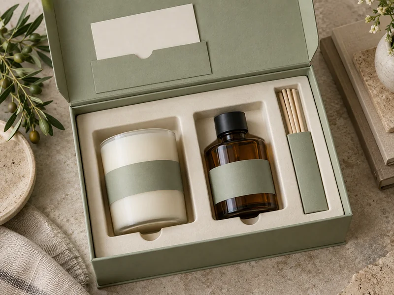
What Role Does the Interior Play Beyond Holding the Products?
The interior establishes relationships through spacing, orientation and emphasis. A larger recess does not automatically make an object the hero; its position, surrounding space and visible label also influence where the eye lands first.
For a balanced two-product story, neither item needs to dominate. Place the jar and bottle so that both are clearly visible, then give the reeds a narrower supporting area. The arrangement should express a pair with an accessory, rather than three unrelated items of equal importance.
The overview of rigid box inserts helps explain the vocabulary of trays, dividers and shaped supports. In this design context, the important distinction is between a visual layout and a fully engineered pack. An attractive illustration alone does not establish how well a particular insert will support glass during handling.
A quiet interior also gives product names room to work. Decorative filler can obscure labels or interrupt a clean outline, while excessive empty space can make the gift look incomplete. Aim for deliberate breathing room around recognisable objects rather than filling every gap.
What Should the Recipient Read After the First Impression?
The next information should resolve practical questions: which item is which, how the collection is connected, and where the product-specific instructions are located. Reserve the little card for the connection between the fragrances, and keep the candle maker’s and diffuser maker’s own directions available as separate, clearly identifiable information accompanying the relevant product.
Seven Rainbow’s article on printed insert cards for gift boxes provides useful background on separating a greeting from a product guide. For this set, a personal message can occupy the front, with a concise description of the pairing on the reverse. Keep promotional requests secondary to the gift itself.
Care language needs its own clear role. The National Candle Association’s explanation of candle labels and instructions reinforces the importance of following the maker’s guidance. A collection story should leave those instructions visible and understandable.
Photography should also distinguish presentation from use. Show the candle unlit while it remains in the box; remove packaging and follow the product directions before use. The association’s candle safety guidance calls for a stable, heat-resistant surface away from flammable objects, which is a useful boundary for any lifestyle scene.
How Does the Gift Remain Coherent After Unpacking?
The shared identity should survive when the box is put away. Repeating the collection name or motif on both vessels lets the candle and diffuser remain recognisable as companions, even if they are displayed in different places.
That is why the story works best when it begins with the products rather than ending at the lid. The box introduces the relationship, the card gives it context, and the objects carry it into everyday life. A successful pairing leaves the recipient with two understandable products and one memorable reason they belong together.