
A designer sends a bright green logo, a buyer forwards a screenshot and a printer asks for a color reference. All three people may believe the color has already been specified. In reality, one person is describing light on a screen, another is communicating an impression, and the third needs an instruction for ink on paper.
Choosing between CMYK and a Pantone spot-color reference is therefore more than a terminology exercise. The decision affects artwork preparation, proofing, the printing route and what the brand should expect from the finished box. Use the following specification steps to connect the brand palette with an agreed printing plan for the box wrap.
Begin With The Parts Of The Design That Matter Most
Look at the artwork before choosing a color system. Is the box mainly photographs and gradients, or does it rely on one uninterrupted brand color? Does a small logo need to match an existing package? Are several different products displayed together?
Identify the areas that are commercially critical. A lifestyle image and a corporate logo do not necessarily require the same approval method. One package can use process printing for imagery and a dedicated ink for a particular element if the selected production route supports that combination.
Share this hierarchy with the supplier. Saying “the blue logo must be matched closely; the photograph should retain natural skin tones” is more useful than asking for every pixel to match a laptop screen. The factory can then explain the practical options and their effect on the quotation.
Describe The Four-Ink Production Route
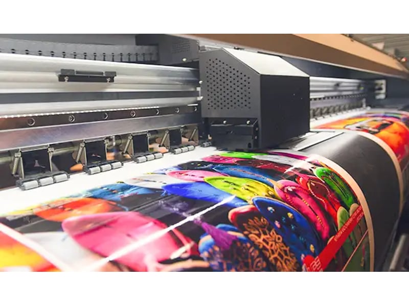
In a CMYK job, the printer builds the image from four ink separations: cyan, magenta, yellow and black. Different combinations create the appearance of photographs, illustrations and many solid areas. It is commonly used where a design contains varied imagery rather than only a few flat colors.
The percentages in a CMYK file describe separations, but their appearance still depends on printing conditions and the material. The same values do not guarantee identical results on every paper or device. Ask the printer which color-managed workflow and output settings apply to the job.
Pantone’s explanation of spot and process color distinguishes a separately formulated color from the four-color process. For a buyer, the practical question is whether the chosen process can reproduce the important parts of the design within the agreed expectation.
Understand A Pantone Spot-Color Request
A Pantone reference provides a named target within a color system. When the job is specified as spot printing, the producer uses a dedicated ink to reproduce the selected color rather than building that element solely from CMYK separations. Confirm that the quotation actually includes that route.
Simply putting a Pantone number in an email does not prove that a separate spot ink will be used. A digital production workflow may simulate the reference through its available inks. Record the substitution as a process-colour interpretation, then approve the resulting print rather than the spot reference alone.
Ask the supplier to state the intended method for every critical color. A clear instruction could identify one logo as a dedicated spot ink, photography as process printing and a metallic detail as foil. Those are three different production decisions even when they appear together in one artwork file.
Keep The Paper Designation With The Reference
Pantone references for graphic printing may include a coated or uncoated designation. These describe the paper presentation used in the reference guide. Do not omit the suffix when communicating the target or assume that changing it has no visible effect.
Pantone’s coated and uncoated explanation describes how paper absorption and surface characteristics affect appearance. Your actual wrapping paper may still differ from the guide paper, which is why a project-specific sample or agreed proof can be important.
For textured, colored or specialty papers, ask how the background material changes the proposed result. A printed swatch on white coated stock cannot answer every question about printing onto a dark textured wrap. Treat the material and color route as a combined choice.
Translate Screen Colour Into A Print Specification
A screen combines light from red, green and blue channels; its RGB values belong to that display-based representation. It is useful for websites, digital presentations and other display applications. A brand may therefore have an RGB or hexadecimal reference that works well online but is not a complete print specification.
Converting that color to a printable result requires a decision about the output process and its reproducible range. Some screen colors cannot be reproduced exactly through the selected printing method. The correct response is to evaluate an achievable printed alternative, not promise that every vivid display color will appear identically on a box.
Keep digital and print brand assets clearly labelled. A web logo file can be included for reference, but provide the production version and relevant print instructions as well. This prevents a supplier from treating an image copied from a website as the authoritative artwork.
Compare The Routes Against The Actual Design
| Design Situation | Route To Discuss | Approval Question |
| Photographs, gradients and many colors | Process printing | Does the proof reproduce the image acceptably? |
| One critical solid brand color | Dedicated spot ink or an approved simulation | Is the actual production method stated? |
| Photography plus a critical logo | Process printing with an additional color if feasible | Which elements use which separations? |
| Short-run development sample | Available sample printing process | What can this sample establish about final color? |
| Metallic highlight | Metallic ink or foil as separate options | Is the intended effect reflective, printed or textured? |
| Dark or textured wrapping paper | Material-specific printing and finishing review | How does the substrate affect coverage and detail? |
Review these scenarios with the printer alongside the artwork and wrap material before selecting the production method. Quantity, equipment, material, artwork and finishing all influence feasibility. Have the quotation name the proposed printing method for this particular box.
Do Not Treat Foil As Another Screen Color
A gold rectangle in a design file could mean a yellow-brown printed color, a metallic ink or transferred foil. Those choices can produce very different visual effects. Explain the desired appearance and request the appropriate production reference.
For a custom book style rigid box, a foil logo may be paired with a printed or specialty-paper background. Approve the relationship between those surfaces on a physical sample where it matters. A flat digital rendering cannot reproduce the way foil changes with viewing angle.
Keep the foil operation identified separately in the artwork. Do not expect a CMYK gold-colored shape to become foil merely because the purchase order uses the word “luxury.” Refer to the agreed foil selection, location and finish in the production specification.
Choose A Proof That Answers The Color Question
Ask what the proposed proof represents. A screen PDF helps confirm wording and placement. A printed development sample shows the design in physical form. A color-managed proof or production-material sample can answer additional questions, depending on how it is made and what has been agreed.
Do not compare a digital sample with an offset production order as if the two routes were necessarily identical. The sample can still be valuable, but its approval scope should be stated. If it is only a layout reference, leave final color approval open.
When reviewing physical references, compare them together under the agreed conditions. Collect the reviewers’ decisions in one dated approval record tied to the physical proof. Record the sample identifier and artwork version so the decision remains understandable at reorder time.
Prepare A Color Specification The Printer Can Read
List the important design elements and how each should be produced. Include the complete color reference where applicable, the intended paper and finish, and the proof that will serve as the approval basis. Identify whether a named reference is a strict matching target or a general design direction.
Check the artwork separations before release. A spot swatch can accidentally be converted to process color during export, while duplicate swatches can create unintended additional separations. Ask the designer and prepress team to confirm that the exported production file preserves the agreed plan.
For an illustrative specification, a box might contain process-printed imagery, one separately approved blue logo and an unprinted paper interior. The exact number of inks and operations must be confirmed by the factory; the buyer’s task is to communicate which appearances are intentional.

Discuss Budget Without Reducing Everything To Ink Count
An additional spot color can affect setup and production, but the overall cost depends on the complete job. Order quantity, artwork coverage, press configuration, materials and finishing also matter. Request comparable quotations rather than assuming a fixed surcharge applies universally.
If the budget is constrained, ask the supplier to compare a dedicated ink with an approved process alternative for the same design. Evaluate the sample difference alongside the price difference. The result may support a simpler route, or it may show that the brand-critical area deserves the additional operation.
Avoid changing the production method after approving color without reviewing the consequence. A cost-saving substitution that changes the visual target needs a new agreement. It is easier to make that decision before printing than after the goods arrive beside an older batch.
Preserve One Master Specification For The Range
Keep the approved color information with the brand’s packaging files, not only in one buyer’s email. Include the reference guide designation, actual paper, production route, finish and sample identifiers. Link each box size or SKU to the relevant version.
Different components may need different technical instructions to achieve a coordinated appearance. A paper box, fabric ribbon and plastic component should not be expected to use identical ink formulas. Establish the intended visual relationship and let each production process be specified appropriately.
Our overview of common rigid box printing methods can help identify the processes under discussion. Once selected, record the actual method in the order documents so the next team does not reopen the decision from an unlabelled screenshot.
Resolve Disagreements Before Production Release
If a proof differs from expectations, identify the disputed element and the reference being used. Is the issue the hue of a logo, the darkness of a photograph or the appearance after lamination? Each points to a different adjustment or approval conversation.
Avoid asking the factory to “make everything brighter” without identifying what should remain unchanged. A broad color adjustment can improve one area while damaging another. Annotate the proof and consolidate feedback from the brand’s decision-makers.
Before releasing the file, confirm the production route, approved proof, material and finish in one message. Send the artwork and these details through the Seven Rainbow contact page when requesting a packaging review. The team can then discuss a printable color plan that matches the design’s priorities and the proposed manufacturing process.