
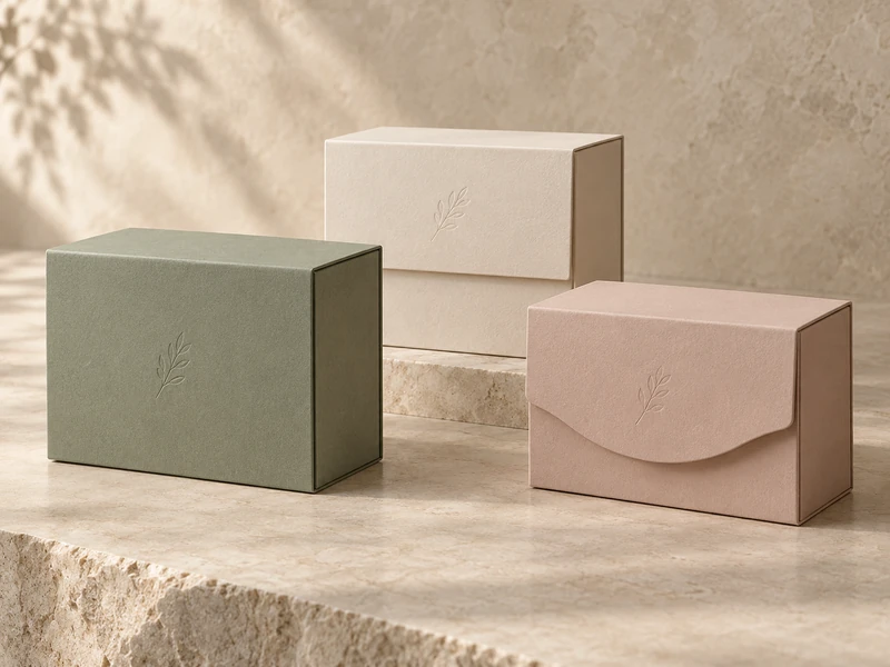
Flap coverage changes how much of a magnetic box’s front is concealed, where the closure engages and how the customer gets a grip to open it. A full flap creates a broad continuous face, a half flap exposes more of the body, and a shaped flap makes the meeting line part of the design.
Seven Rainbow offers full, half, triangular and custom flap options. Choosing among them is a structural decision as well as a visual one: the outline must leave workable space for magnets, wrapping, finger access and reliable alignment.
What Is Being Covered by the Flap?
In this comparison, coverage refers to the front flap extending down over the front of the box body. It does not describe how much of the top opening the lid covers.
Mark the flap on a closed side view and a front view. This avoids confusion with a shoulder-neck box’s lid coverage or with the inner tray depth.
Seven Rainbow’s magnetic rigid box options separate flap shape from other choices, including foldable construction and lid attachment. Keep those decisions separate in the brief so a request for a half flap does not accidentally imply a different overall box architecture.
When Does a Full Flap Work Well?
A full flap suits a design that needs a quiet, largely continuous front surface. The body is visually enclosed when the flap is down, allowing colour, texture or a single restrained mark to carry the exterior.
This can work well with linen-textured paper, a broad botanical composition or a minimal foil detail. There is less interruption from an exposed front-body strip, although the flap edge and lower meeting line still require careful alignment.
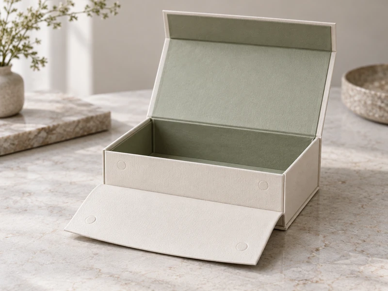
A larger flap also gives the designer more area in which to locate closure components, but area alone does not establish closure strength. Magnet position, engagement distance and the stiffness of the assembled layers remain decisive.
What Can Go Wrong With a Full Flap?
If the free edge sits too close to the base or has no obvious lifting point, the customer may search for a way in. A clean front should still communicate where opening begins.
Check whether the flap lies flush across its width. A broad panel can make bowing, uneven wrap build-up or a proud corner more visible than a short flap would.
Also inspect the lower corners after repeated use. Those areas are exposed to handling and can reveal poor paper turning or a vulnerable sharp point.
What Does a Half Flap Change?
A half flap leaves part of the front body visible, creating a horizontal division. That can lighten the appearance and introduce a deliberate two-colour relationship without adding a separate sleeve.
The division becomes an important alignment line. A small variation in flap height or squareness may be noticeable when it runs across a contrasting front panel.
Use the exposed strip intentionally. It might repeat the insert colour or provide a quieter foundation beneath a textured cover, rather than becoming a leftover area with no visual role.
Does Less Coverage Mean a Weaker Closure?
Not necessarily. The closure depends on how the magnets and opposing surfaces meet, not simply on the percentage of front wall covered.
However, a shorter flap provides less vertical room for component placement and edge clearances. The sampling team needs enough material around the closure to produce a stable, neatly wrapped assembly.
Do not scale a full-flap drawing down proportionally and assume every concealed detail will still fit. Reposition the components around the new geometry.
When Is a Shaped Flap Worth the Extra Detail?
A shaped flap is worthwhile when its outline reinforces the packaging concept and remains comfortable to use. Curves, angled edges and triangular points can make the opening line distinctive without adding more printed decoration.
The shape should be judged both closed and open. A graceful curve on the front may create a narrow tip that is awkward to wrap or a projection that catches during handling.
For a triangular design, examine the point rather than only the broad shoulders. If customers naturally pull the tip, it must tolerate that use, or the intended gripping area needs to be clearer.
How Should the Options Be Compared?
Use the same box footprint, material family and contents when comparing flap concepts. Otherwise, a difference caused by board stiffness or product weight can be misread as an effect of coverage.
| Flap Type | Visual Opportunity | Sampling Priority |
| Full | Broad, continuous front face | Flushness, lower edge and clear lifting access |
| Half | Exposed body strip and colour contrast | Horizontal alignment and closure placement |
| Shaped | Distinctive meeting line | Grip location, narrow areas and wrapped curves |
For every version, open the box with one hand stabilising the base and the other lifting the intended edge. Watch whether the user bends a corner, drags the box or applies a sudden tug.
The exercise should reveal where force enters the flap. An attractive outline is only resolved once its normal opening movement feels controlled.
Where Should Magnets and Artwork Be Positioned?
Place the closure components according to the assembled panel geometry, then build the artwork around the approved layout. Critical graphics should not depend on an uncertain meeting line.
Fine borders crossing the flap-to-body boundary can make small production differences conspicuous. A deliberate gap, broad motif or contained logo placement may suit the structure better.
A heavy emboss or layered decoration near a concealed magnet can also change local thickness. Review such details together rather than approving the closure on a plain sample and adding material later.
Seven Rainbow’s artwork requirements checklist is relevant once the closure layout is fixed. The dieline should make folds, turned edges and critical positioning understandable to the artwork team.
Does Flap Coverage Determine How Far the Lid Opens?
No. Flap coverage and rear lid attachment are different details, even though both influence the overall opening experience.
Seven Rainbow distinguishes glued-back and non-glued lid arrangements on its magnetic-box page. A flap choice should therefore be paired with an explicit request for the intended lid position, rather than used as shorthand for it.
If the interior cover carries a short message or product sequence, demonstrate its visibility in the intended open position. The cover should not need to be held at an awkward angle merely to show the design.
For a related cover-and-tray presentation, compare the book-style rigid box range. The spine and tray arrangement may matter more to the reveal than the front flap silhouette.
What Should Be Checked With the Real Contents?
Test the closing path with the fitted insert, product and any card in place. A cover that sits correctly on an empty box can be pushed upward by an overfilled interior.
Check magnetic engagement across several openings, including slight misalignment during ordinary use. The user should not need to press the flap carefully into one exact spot every time.
If the package will be shipped, treat the closure as one part of the complete system. The ISTA guide to test procedures helps distinguish preliminary screening from distribution assessments; a satisfying magnetic click is not evidence of transport performance.
Also inspect the package after removing and replacing the product. A reusable gift box should close predictably without the contents having to be restyled for a photograph.
How Can Coverage Support a Seasonal Design?
A stable flap outline can become a recognisable part of a packaging family. Colour, surface motifs and small printed elements can change while the opening gesture remains familiar.
Seven Rainbow’s seasonal visual-story article offers a useful direction for that approach. Decide which features should remain consistent before introducing a new silhouette for each campaign.
For sets intended to remain in use, the second-life gift box discussion adds another question: will the chosen flap be comfortable and tidy after repeated everyday opening?
How Should the Flap Edge Be Finished?
Inspect the edge from the same distance as the rest of the package, then look closely at corners and curves. The paper should follow the intended silhouette without distracting folds or visible board.
A complex outline can create narrow areas where several turned paper sections meet. Ask the sampling team to show the actual finished edge rather than approving only a flat cut shape.
Compare the front line with the box resting naturally on a table. Holding it tightly shut for inspection can conceal a flap that sits unevenly when released.
Also decide whether a small exposed body band is intentional. If it is, define the relationship clearly; if it is not, resolve the geometry before artwork makes the mismatch more conspicuous.
What Should the Final Brief Specify?
Include the flap outline, coverage height, lifting area, closure position and rear lid attachment. Add front and side views so these relationships are visible without interpretation.
Review the finished paper and decoration on the approved construction before production. The most successful choice is the flap whose outline, closure and hand movement feel like one coherent design.