
Review metallic, pearlescent and holographic wraps as physical materials on a wrapped box, under both a controlled reference light and the lighting where the gift will be seen. Move the box as well as your viewing position. A single face-on photograph cannot show how the finish changes across a lid, around a corner or beside printed lettering.
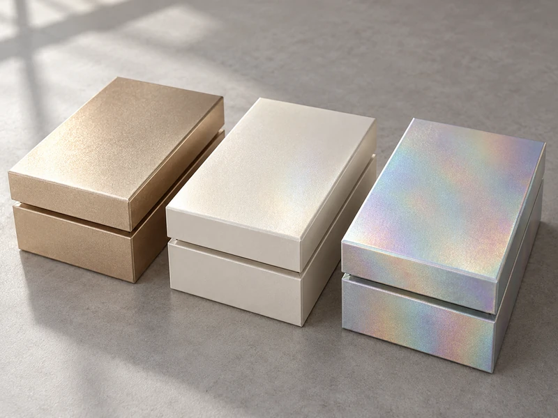
These finishes are often grouped together because they shine, but they create different kinds of visual movement. The decision for a SevenRainbowpack rigid box is whether that movement supports the product, the graphic layout and the opening sequence. Brightness on its own is a poor selection criterion.
What Effect Are You Actually Asking the Wrap to Produce?
Describe the desired behavior before choosing a swatch. “A quiet glow on an ivory lid” gives the material discussion a different direction from “a crisp metallic reflection” or “a pastel color shift as the box turns.”
Metallic wraps can create a directional, metal-like reflection; pearlescent papers often produce a softer luminous effect. Holographic materials can introduce changing spectral colors or patterns. These are useful descriptions of appearance, not a substitute for identifying the actual stock, coating and construction offered.
| Wrap Direction | Question to Ask in the Sample Review | Likely Design Tension |
| Metallic | Does the broad reflection hide the graphic at a normal viewing angle? | Strong shine versus readable detail |
| Pearlescent | Is the glow visible enough in the intended setting? | Subtle surface character versus an effect that disappears |
| Holographic | Does the color movement remain controlled around the whole box? | Visual movement versus a crowded composition |
A useful first comparison uses the same box shape and graphic area for each material. If one candidate appears on a large empty lid and another on a narrow printed strip, the comparison mixes material, scale and artwork at once.
Why Is a Flat Swatch Only the Beginning?
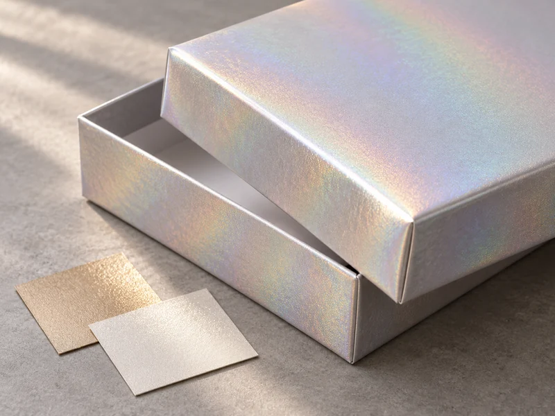
Wrapping introduces changes in orientation, bends and seams that a flat sheet does not show. A reflection that looks continuous on the lid may break at a sidewall, while a holographic pattern may travel differently across neighboring panels.
Ask for a wrapped corner, a lid edge and an inside turn-in during development. These small samples can reveal cracking, whitening, visible joints or awkward pattern direction before the whole design is decorated.
For a shoulder-neck rigid box, compare the lid, visible neck and base together. A highly reflective lid above a calmer neck can be intentional, but matching those parts from separate photographs is unreliable.
A book-style rigid box adds a different concern: the cover changes angle during opening. Review the closed cover, the moving hinge area and the inside reveal instead of approving only the closed front view.
Which Lighting Conditions Should Be Used?
Use a defined reference condition for repeatable comparisons, then check the intended retail or gifting environment separately. Keep those roles clear: a warm boutique lamp can reveal a practical problem, but it should not silently replace the agreed approval light.
The International Color Consortium’s introduction to color management describes a D50-based reference viewing environment for graphic arts. That provides useful context for controlled comparisons; it does not mean an ordinary desk lamp becomes a reference source because its packaging lists a similar color temperature.
- Compare the candidates and the retained reference under the same light.
- Use a neutral surrounding surface so nearby colors do not dominate the reflection.
- Check a softer, broad light for overall color and a more directional light for glare and texture.
- Include the intended shelf or counter lighting where practical.
- Record the conditions alongside the decision rather than relying on memory.
Window daylight is helpful for seeing the box in an everyday setting, but it varies with time, weather and surroundings. Keep it as an additional observation when consistency between review sessions matters.
Which Views Reveal the Wrap’s Full Range?
Start with the lid in the position a recipient would naturally hold it, then tip its far edge toward the lamp and turn the box a quarter turn. Watch the lettering during the movement: can it still be read as the bright reflection passes across it? A finish that needs a carefully staged angle to look convincing deserves another look on the intended shelf.
Run the shortlisted papers through that same sequence beside the reference. Keep the light fixed, rather than chasing the most flattering highlight for each specimen. Note whether the sidewalls become noticeably duller, whether a prismatic band overwhelms the logo, and where the preferred effect returns as the lid moves.
How Do You Keep Graphics Legible on a Moving Surface?
Test the actual small lettering, logo and fine lines on the selected wrap. A dark mark can have strong contrast in one position and disappear into a reflected shadow or bright flare in another.
Leave enough quiet surface around important information. A holographic pattern already contributes color and movement, so adding a dense illustration, foil and spot gloss can make the intended focal point harder to identify.
Consider putting functional text on a calmer panel or a separate printed area. This is particularly useful for small instructions or assortment information that must remain easy to read. The decorative finish can still carry the visual identity of the lid.
Our rigid-box artwork checklist explains why finishing areas and their relationship to print need explicit preparation. For a reflective wrap, include an actual-size proof of the smallest critical detail in the sample request.
Should the Effect Cover the Entire Box?
Only if the whole-box result earns its place. A pearlescent lid with a matte base can feel more composed than a finish applied everywhere, while a narrow holographic area can give a clear point of interest without competing with the product inside.
The alternatives are worth comparing physically. A flat mock-up makes a full wrap and a small accent look similarly manageable, but a real box reflects light from several directions at once.
For a removable accent, our guide to belly band materials and finishes offers another design route. A specialty-paper band can change the surface character while leaving the main box quieter.
Touch matters too. In the context of tactile perfume packaging, a finish contributes to the handling experience as well as the photograph. Review the combination of sheen, texture and opening rather than treating each as a separate decorative upgrade.
What Can a Photograph or Video Confirm?
It can document which sample was examined and show the direction of a reflection or pattern change. It cannot guarantee an exact visual match on another screen, where exposure, white balance, display settings and room lighting differ.
For remote review, place the reference and candidate in the same frame and use steady lighting. Record a short, slow rotation without changing exposure midway. Keep the physical sample as the approval reference.
Do not confuse a material that changes with angle with an inconsistent batch. At the same time, do not dismiss every mismatch as “just the light.” Compare both specimens side by side through equivalent movements before deciding which explanation fits.
What Should Be Approved With SevenRainbowpack?
Record the stock identity, intended orientation, box construction, printed areas and any coating applied over the wrap. Retain a finished sample that shows the corners and seams as well as the main display face.
Include an agreed handling review for visible marks, surface wear and the finished opening areas. Appearance approval under light does not establish resistance to rubbing or repeated use, so those questions need their own observations.
A useful approval describes what the buyer should see: a soft glow, a clear metallic highlight or a controlled color shift across specified panels. Once that behavior is demonstrated on the finished structure, the wrap has become part of the box design rather than a promising square in a swatch book.