
Tactile perfume packaging tells a fragrance story through the surface a person touches, the movement that opens the box, and the way the bottle is revealed. A textured wrap, a clear opening point, and an uncluttered interior can work together to suggest a mood before the fragrance is experienced. The most convincing design gives each detail a purpose while keeping the bottle easy to remove.
For a fragrance brand, this is an opportunity to translate an invisible product into something tangible. The following journey explores that translation through design concepts, rather than claiming that one texture produces the same response in every person.
What Can a Box Say Before the First Spray?
A box can introduce a fragrance’s visual and tactile character, but it cannot communicate the complete smell. Think of packaging as the opening paragraph of a story: it establishes expectations that the fragrance must then support. A quiet surface and a precise reveal may suit one creative direction, while an expressive pattern may be right for another.
Start with a small vocabulary drawn from the fragrance concept, such as airy, warm, crisp, or enveloping. Translate those words into a few physical decisions instead of filling every available surface with decorative effects. Keeping the vocabulary short makes it easier to carry the same idea from the outer wrap to the bottle setting.
Sevenrainbowpack’s custom perfume rigid boxes provide a relevant starting point, with bottle positioning, printed decoration, and several opening structures. The creative task is to connect those features into a coherent experience. Product protection remains part of that experience, even when the visual story is subtle.
How Does the First Touch Establish the Mood?
The outer wrap establishes the first tactile impression because it is usually the largest surface in contact with the hand. Fine grain can introduce a quiet rhythm, while a smooth surface places more emphasis on form and printed detail. Neither is inherently more luxurious; the effect depends on the complete composition.
Where Should Texture Be Most Noticeable?
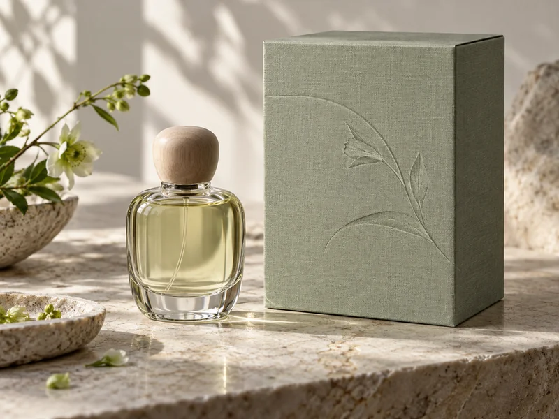
Concentrate the tactile idea where the recipient naturally holds the box or moves a finger to open it. A subtle relief on the front can invite closer attention without competing with the product name. A quieter surrounding area gives that detail room to be noticed.
For example, a botanical fragrance concept might use a fine paper grain with a single recessed leaf outline. That is an illustrative design direction, not a claim that textured paper smells botanical or appeals to every audience. The connection should make sense alongside the fragrance description, bottle, and other brand materials.
The distinctions in our article on rigid box wrapping materials help separate the surface layer from the structural board beneath it. A paper that looks richly textured in a close-up photograph may feel much quieter at normal handling distance. Design around the actual hand-held object, not only the enlarged image.
Can Several Finishes Work Together?
Yes, when they have different jobs. One finish can establish the overall surface, while a second directs attention to a small motif or mark. Adding more effects is useful only when the extra detail makes the story clearer.
- Use a broad, restrained surface to establish the main tactile character.
- Reserve relief or shine for a meaningful focal point.
- Keep small lettering legible against the paper texture.
- Carry one visual detail into the interior to connect the two stages.
What Happens When the Recipient Finds the Opening?
The opening should be understandable without a search for hidden instructions. A visible lid edge, an accessible pull, or a clearly oriented cover tells the hand where to begin. The resulting movement becomes part of the story because it controls when the bottle enters view.
With a book-style rigid box, the cover moves aside while the product remains in a defined setting. The inside cover can introduce a short fragrance note or a visual continuation of the exterior. Keeping the message brief allows the bottle to remain the central object.
How Can a Reveal Feel Deliberate Without Becoming Difficult?
Use a small number of meaningful actions. Opening a cover and lifting a bottle can feel complete without adding several sleeves, wraps, and concealed compartments. Each extra layer should contribute protection or useful information, rather than simply delaying access.
An opening that requires a sharp tug can interrupt an otherwise calm presentation. Likewise, a bottle held so tightly that the recipient must grip its cap turns a visual detail into a handling problem. Provide access around the bottle body and make its removal direction apparent.
The goal is a sequence that feels understandable at normal speed. Someone opening a gift at a crowded table should not need the careful movements of a product photographer. When the perfume returns to its box between uses, the recipient should still be able to lift the cover and reach the bottle comfortably, with no need to repeat an elaborate presentation ritual each morning.
How Should the Interior Complete the Story?
The interior should make the bottle easy to see, identify, and lift. A supporting insert can frame the silhouette while keeping space available for fingers. The lining, card, and cover should reinforce the main idea without creating several competing focal points.
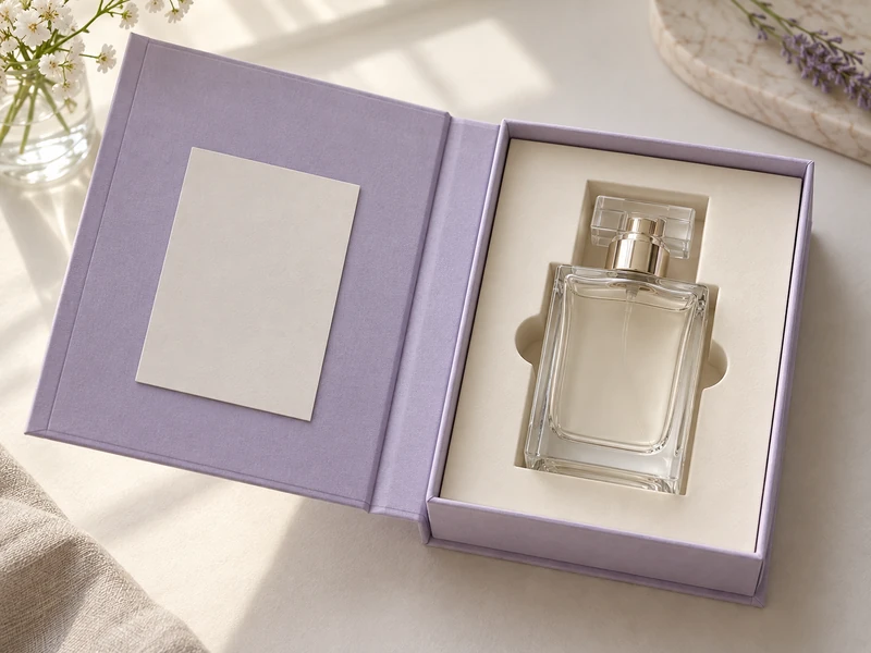
Consider a soft floral concept with a lightly textured exterior and a quieter cream interior. The change in surface gives the bottle a distinct stage, while a repeated curved motif links the cover to the inside. This is a possible composition, not a documented Sevenrainbowpack customer project.
For a brighter fragrance story, contrast can come from the opening itself: a restrained cover reveals a lively inner color. The color should support the existing identity, not introduce a new promise that the fragrance description cannot explain. Our discussion of perfume box design lessons provides additional context for keeping the bottle and packaging visually connected.
What Belongs on the Inside Cover?
Include information that improves this moment of discovery. A short creative note can help the recipient understand the intended mood, while essential product information must remain easy to locate wherever it is required. Avoid turning the inside cover into a dense wall of brand history.
- A concise introduction to the fragrance’s creative idea.
- A small visual detail repeated from the outer cover.
- A readable product identifier when the collection contains several fragrances.
- A separate card only when it offers information worth keeping.
What Does Sensory Research Actually Support?
Research supports the broader idea that sensory experiences can interact, but it does not provide a universal recipe for perfume boxes. A study of odor and texture in cosmetic creams found interactions in participants’ responses under its experimental conditions. The authors also reported context-dependent results and identified packaging as a possible direction for future research.
That study examined creams applied to the skin, not rigid perfume packaging. Applying its general theme to a gift box is a design interpretation, not direct evidence that a particular paper will improve fragrance preference. Claims about sales, emotional response, or perceived quality would need evidence specific to the proposed packaging and audience.
This distinction leaves plenty of room for creativity. Designers can use texture as a narrative material while remaining honest about what is an artistic choice. The strongest explanation is often specific and modest: this grain echoes the illustration, this opening reveals the bottle clearly, and this interior gives the product room.
What Remains After the First Opening?
A memorable box should still make sense once the surprise is over. The recipient may return the perfume to its insert, leave the box on a shelf, or keep a small printed note. Surfaces and opening details should support these ordinary actions as naturally as the initial presentation.
Restraint can help the design stay readable across those moments. Our article on simplicity in perfume packaging explores how a focused visual identity can carry meaning without constant embellishment. For tactile design, the same discipline means giving texture, movement, and reveal distinct roles.
The story is complete when the recipient understands the box through use. Their hand finds the opening, the bottle appears clearly, and the surrounding details support the fragrance’s character. That continuity gives tactile perfume packaging its creative value.