
Cosmetic gift boxes can make a collection feel like a daily ritual by giving each item a clear role, arranging related products together, and placing guidance where the recipient first needs it. The design should explain the relationship between the products without inventing a skincare routine or replacing their individual directions. A useful box welcomes the recipient, introduces the contents, and remains understandable after the first photograph.
That balance matters when bottles, jars, and accessories arrive together but look very similar. Matching colors create a family resemblance, yet a recipient still needs to distinguish a lotion from a cleanser or a decorative accessory from an application tool. Thoughtful packaging makes those differences visible within a coherent presentation.
Start With a Moment, Not a Collection of Bottles
What makes a beauty set feel intentional? A recognizable occasion gives the collection a reason to exist, while the products and their approved instructions determine what the recipient actually does with it.
Consider a fictional weekend beauty gift containing a cleanser, a moisturizer, and a soft headband. The story might be a few unhurried minutes at the vanity, expressed through calm spacing, a welcoming lid message, and an accessory that sits beside the two containers. This is a packaging concept, not a recommendation that every formula belongs in the same routine.
A makeup gift could tell a different story around getting ready for an evening, with a compact, a lip product, and a brush. Here, the layout can show complementary roles without suggesting that every item must be used in a fixed sequence. The occasion supplies the narrative; accurate product identification supplies the practical information.
Seven Rainbow’s cosmetic rigid box range includes formats for skincare, makeup, and beauty accessories. That variety allows the packaging concept to start from the actual collection rather than squeezing unrelated products into a familiar decorative arrangement.
The First Opening: Let the Recipient Understand the Set
Give the Eye One Place to Begin
The first open view should reveal what the gift contains before asking the recipient to read a long story. A larger container can serve as the visual anchor, while smaller products sit in a clear supporting group. The most prominent object does not automatically become the first product to apply.
Keep names facing the reader where the container geometry permits, and avoid hiding the distinguishing words behind tall insert walls. If two bottles have nearly identical silhouettes, position them so their labels remain separate and easy to associate with their own cavities. A beautiful row loses its usefulness when every product must be removed just to identify it.
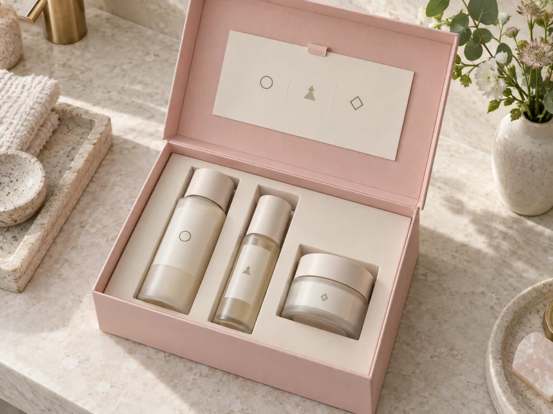
An attached lid offers another information surface without adding a loose piece to the first opening. With a hinged lid rigid box, a brief welcome can stay above the contents while the product tray remains visually quiet. Longer details belong on a separate guide that the recipient can bring closer to read.
Use Zones to Explain Relationships
Zones work best when they correspond to something meaningful: products and tools, full sizes and miniatures, or two clearly named parts of a collection. They should not imply formula compatibility merely because items share a compartment. The arrangement is a navigation aid, not an additional product claim.
- Place a tool near the item it supports, while keeping their surfaces separated.
- Give similar bottles individual spaces so their identities remain distinct.
- Reserve a visible place for the guide instead of burying it beneath the tray.
- Leave enough access around each item for a deliberate, comfortable lift.
The available rigid box insert options offer different ways to organize the contents. For this kind of storytelling, the important design question is how the insert presents and releases the products, as well as how it holds them. A deep cavity may look tidy but can conceal information that the recipient needs immediately.
At the Vanity: Turn Decoration Into Useful Cues
Once the gift reaches the vanity, the packaging should still make sense outside its original arrangement. Use consistent names and a small set of repeated cues across the containers, insert, and guide. A recipient should be able to reconnect a removed item with its description without solving a visual puzzle.
Combine Words With Symbols
A circle, leaf, or simple line motif can help someone locate the corresponding guide entry, but it should accompany a readable product name. Color alone is a fragile way to distinguish similar items, especially under changing light. Repeating both a word and a symbol gives the collection more than one route to recognition.
Keep the system modest: three products do not need a complex legend with multiple color families and decorative codes. If a symbol already means something on the product label, avoid giving it a different meaning on the box. The package should reduce interpretation, not introduce another language to learn.
| Packaging Surface | Useful Information |
| Outer Lid | Collection identity and the occasion behind the gift |
| Inside Lid | A short welcome and a clear invitation to explore |
| Beside Each Product | A readable name or a matching identification cue |
| Removable Guide | Product roles and references to their own directions |
Keep the Guide Helpful and Bounded
A beauty gift guide can introduce each product, explain the theme, and point out where detailed directions are found. It should not create new application frequencies, promise results, or compress warnings into decorative shorthand. When the collection contains alternatives rather than sequential steps, say so plainly.
The FDA’s guidance on using cosmetics safely emphasizes reading labels and following product directions. In packaging terms, that supports keeping essential instructions accessible and avoiding a gift card that appears to supersede them. A charming story and accurate guidance can occupy the same box without competing.
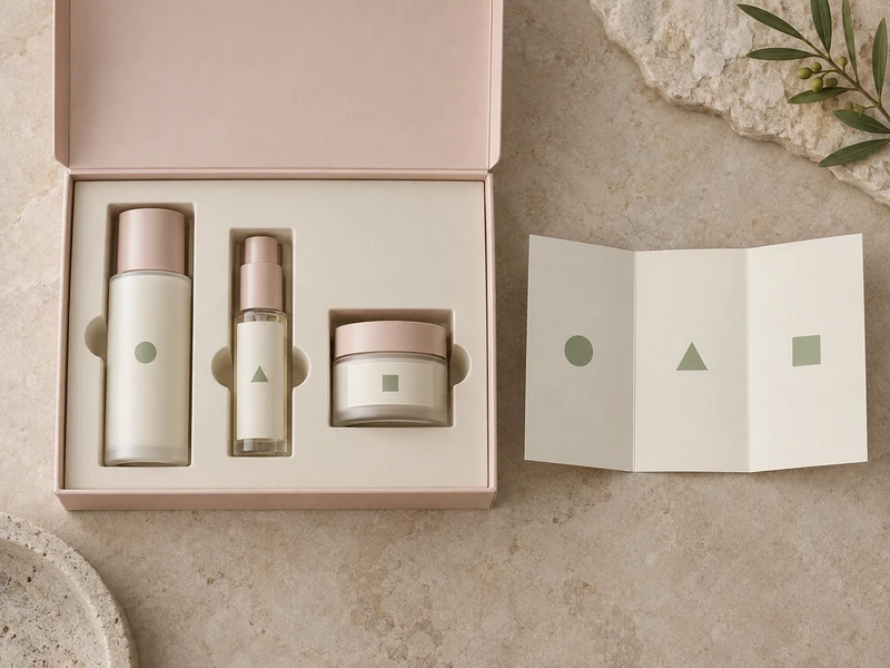
A removable card also accommodates the way people actually explore a gift: one person reads first, while another looks at the products and returns to the explanation later. The approach in printed insert cards for luxury gift boxes provides a useful starting point for deciding what deserves space on that small surface. The card should earn its place through clarity, rather than simply repeat the lid.
Three Scenes for One Fictional Beauty Collection
A Quiet Morning
For a morning-themed concept, let daylight colors and an uncluttered arrangement establish the mood. Keep the collection name short and the product names prominent, with accessories grouped to one side. Any suggested sequence must come from the actual products’ directions, rather than from the position of a sunrise illustration.
A Weekend Away
A travel-inspired presentation can emphasize the compact scale of the collection and the relationship between the items. A small guide might identify which container is which after they leave the box. Avoid implying that the gift box is a leakproof travel case or that every container meets transport restrictions.
An Evening at Home
An evening concept can use a deeper accent color and a slower visual rhythm, leaving more space around a central jar. A soft accessory can sit in its own zone without covering the labels. The mood comes from composition and language, not from unsupported promises about sleep, relaxation, or skin outcomes.
What Should Remain After the Unboxing?
The most useful visual idea is the one the recipient can still recognize after the ribbon and tissue are gone. Keep the main identity on the durable surfaces and make the guide easy to return to its place. Loose decoration should never be the only element that distinguishes one product from another.
Paper texture can provide continuity between the exterior, lid lining, and card without covering every surface in print. The possibilities described in rigid box wrapping materials can help a designer explore that continuity. The choice should support readable information and the intended handling experience alongside its visual character.
A cosmetic gift box becomes a convincing daily-ritual story when its parts agree: the occasion explains the collection, the layout explains the relationships, and the guide clarifies the identities. Keep those roles distinct and the recipient can enjoy both the presentation and the products. The result is a gift that feels thoughtfully introduced from its first opening to its next use.