
Give each drawer a visible identity before it opens, then repeat that identity inside the tray. A short name or numeral, a consistent position and a secondary color cue usually do more than three different decorative finishes. The recipient should know which layer to pull without searching every compartment.
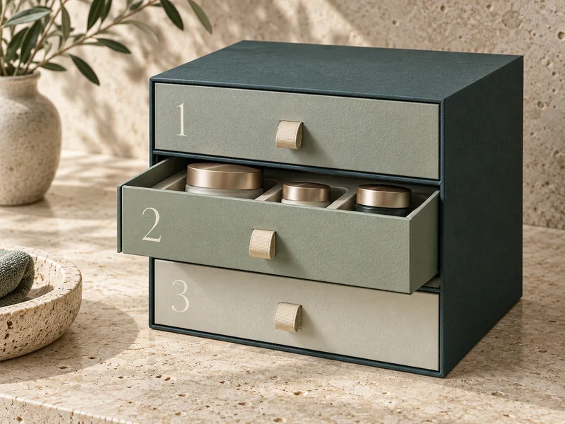
A cabinet-like gift box offers an unusually good opportunity for a brand to organize a collection. It also creates a small navigation problem: the closed drawer hides the very product that explains its purpose. For a SevenRainbowpack project, design that closed front alongside the insert layout, rather than adding labels after the structure is approved.
What Should the Drawer Identity Explain?
First decide whether it identifies a product group, a sequence or a specific item. Those are different jobs. A beauty ritual might need an order, while a jewelry collection needs a way to return an item to its proper home.
Consider an illustrative three-layer skincare gift: cleanser above, treatment in the middle and accessories below. A numeral tells the customer what comes next, but a short product-group name tells them where to look again next week. If the box is intended for repeated use, that second task deserves equal attention.
SevenRainbowpack’s drawer rigid box range includes double-layer, multiple-layer and divided arrangements. Choose the number of drawers from the contents and access pattern first. Adding another level simply to make the package feel elaborate creates another front that must earn its place.
Keep a working map with three entries for each level: customer-facing identity, contents and insert version. This map becomes the reference for artwork, packing photographs and later assortment changes. It prevents the designer and packing team from using different names for the same drawer.
Which Front Cues Work Without Making the Box Busy?
Use one primary cue and one supporting cue. The primary cue should survive ordinary room light and a quick glance; the supporting cue can carry more of the brand’s personality. A large quiet numeral beside a small woven pull is often enough.
Place identification in the same area on every drawer. If the top label sits beside its pull and the next sits against the opposite edge, the customer has to relearn the layout. Consistency here gives you more freedom in the surrounding illustration or paper texture.
| Front Cue | Best Use and Limitation |
| Short product-group name | Useful for finding items again; confirm space for every language. |
| Numeral plus brief name | Useful for an ordered ritual; keep the sequence consistent inside. |
| Color plus a simple symbol | Useful for a visually led collection; the symbol must remain distinct without color. |
| Different pull textures | Useful as an extra tactile cue; avoid making identification depend on touch alone. |
Foil can be a beautiful accent but a poor sole identifier when it disappears in reflection. Print the essential information legibly, or approve the foil at the actual viewing angle. A subtle blind emboss may belong in the decorative layer rather than carrying an instruction that everyone must read.
Is Color Enough on Its Own?
Color helps recognition, but pair it with text, a numeral or a distinguishable symbol. W3C’s guidance on using color makes that principle explicit for digital information. Applying it to drawer fronts is a design judgment, not a claim that a packaging sample has passed a web accessibility standard.
Try viewing a photograph of the closed box in grayscale. If every level becomes identical, the identification system is relying heavily on hue. You can preserve the original palette while adding a small, readable cue.
Where Should the Identity Reappear Inside?
Print the same identifier on an exposed tray side or another surface the customer can find when the drawer is out. A mark concealed beneath a bonded insert has little value during repacking. Keep its wording identical to the drawer front so that a removed tray still has one unambiguous identity.
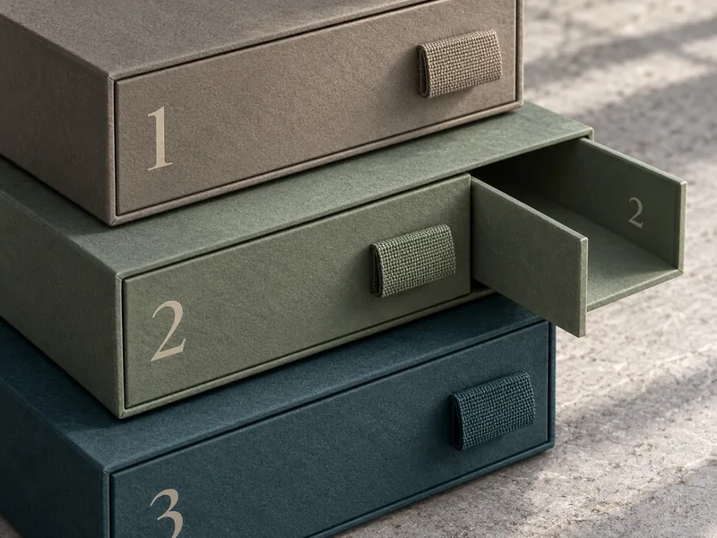
This becomes especially useful when drawers can be fully removed. Once two empty trays sit on a table, their original positions may be surprisingly hard to remember. An interior identifier lets the customer restore the arrangement without comparing small differences in cavity shape.
Keep operational marks away from product contact and the sliding surfaces. A raised sticker on a rubbing edge can catch or wear. Printed identification on a non-contact side panel is a cleaner proposal to assess in the sample.
Our guide to keeping a drawer tray from sliding out during handling addresses a separate decision: how far the tray should travel. Set that travel deliberately, because a permanent stop may change which interior marks the customer can see.
Should the Pulls Differ Between Layers?
Only where a difference helps the user and remains practical to manufacture. Identical pulls with different front labels are easy to understand and can look beautifully restrained. Different ribbon colors or textures add another cue, but they also add parts that must be packed in the correct order.
A pull must still perform its opening job. A tiny decorative loop that looks elegant on an empty sample may be awkward with a loaded drawer. If the lower level is heavier, review its grip and withdrawal behavior using that actual load.
The ribbon pull versus thumb notch comparison is helpful when deciding how much of the drawer front can carry artwork. Reserve room for fingers as well as identification. A label should never occupy the only obvious place to grip.
Can Different Drawer Heights Identify the Layers?
They can reinforce a system, especially when the contents demand different depths. They are less dependable when the height difference is slight or the box is viewed from above. Treat the physical silhouette as supporting information.
Do not deepen a drawer merely to make it look different. That can leave spare space around a short product, raise the overall box and complicate the sleeve. Let the product fit establish depth, then make the front readable within it.
What Happens When the Assortment Changes?
Separate the permanent exterior story from information likely to change. A seasonal scent name printed across the whole drawer front makes that tray specific to one release. A stable group name, with variant information on a replaceable card, may serve a changing collection better.
For a set that evolves over several launches, read our article on building a multi-SKU rigid box packaging system. The identification scheme should accommodate the planned range, including the smallest label area and longest product name. Testing only the easiest variant leaves the difficult one for production.
If one drawer becomes optional, decide what the closed front should communicate when it is absent. An empty level labeled as a product can make the gift look incomplete. A different insert or a revised drawer map may be needed for that configuration.
What Happens to a Pattern Across Several Drawer Fronts?
A continuous illustration can unify the closed cabinet, but it can also make the individual drawers look interchangeable once removed. Preserve the layer identity within each front rather than relying on its original position in the larger picture. Review one drawer by itself as well as the complete box.
For an illustrative botanical collection, the overall scene could run across the fronts while each level keeps its own small name in a fixed corner. The customer sees one composition when the cabinet is closed and a recognizable compartment when a tray is on the table. Neither view needs an additional decorative panel.
Check the artwork at the actual drawer gaps. Fine lines that nearly meet across two fronts can make ordinary registration variation look like a mistake. A deliberate break or quieter area around each gap often gives the structure a more composed appearance.
Keep the identification clear when a pull hangs down naturally. The approved photograph should show the ribbons as they settle, not carefully lifted away from the print for the camera.
How Do You Approve the System on a Real Sample?
Hand the closed set to a person who has not seen its layout and name one item to retrieve. After that first attempt, ask them to exchange two loaded trays and restore the original arrangement. Note any wrong drawer, covered label or uncertain return position; those observations identify the cue that needs improvement.
- Review the box closed, partly opened and with trays removed.
- Check the essential marks under diffuse light and a reflective retail light.
- Compare the front, tray-side identity and packing reference for agreement.
- Confirm that pulls do not cover the labels when they fall naturally.
- Review the longest language version on the actual print size.
For a SevenRainbowpack brief, provide the layer map, loaded product samples and artwork for the smallest front. If the collection uses a side-opening cover as well as drawers, the book-style rigid box options offer a second place for an overview of the set. Keep that overview brief enough that each drawer can still explain itself.
The finished package can stay visually calm: one paper family, controlled color shifts and very little text. Its sophistication comes from how readily the customer understands the contents. When every layer is easy to recognize, the extra structure feels useful each time the box is opened.