
Round gift box design becomes coherent when the lid, curved sidewall, and interior each play a distinct visual role. Use the lid for a clear focal point, the sidewall for a rhythm that survives rotation, and the interior for an arrangement that responds to the products. Repeating one color or motif across those surfaces connects the experience without making every view identical.
A circle changes more than the outline of a package. It removes the corners that normally organize a rectangular composition and creates a surface that people may approach from several directions. Those qualities invite a different way of placing images, words, and empty space.
Read the Box as Three Connected Views
Where should the design begin? Start by separating the three views a recipient encounters: the closed lid from above, the cylinder from the side, and the open base with its contents. Each view has a different shape, scale, and relationship to the eye.
The National Gallery of Art introduces color, line, shape, form, and texture in its Elements of Art resource. Those terms provide useful vocabulary for discussing a package, although the following applications are our design interpretation. A printed circle is a shape; the cylindrical box adds volume and changing viewpoints.
| View | Primary Visual Task |
| Circular Lid | Establish identity and a point of attention |
| Curved Sidewall | Carry a pattern or color rhythm around the volume |
| Open Interior | Reveal the products through a deliberate arrangement |
Seven Rainbow’s custom round rigid boxes include several opening formats and decorative possibilities. The graphic idea should respond to the selected structure, especially where a lid overlaps the base. An illustration that looks complete on a flat drawing may be partly covered on the assembled box.
The Lid: How Does a Circle Hold Attention?
Choose a Center or Deliberately Move Away From It
A centered emblem is easy to organize because the surrounding edge provides a consistent reference. It can work well with a short collection name and a quiet border. The challenge is keeping the result distinctive without adding so many rings that the center feels trapped.
An off-center composition creates another kind of balance. Imagine a botanical sprig entering from the lower right, with the name placed in the open area above it. The two elements do not need equal size; their placement and visual weight can hold the composition together.
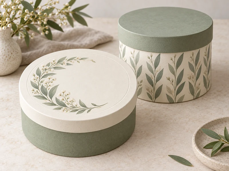
A crescent arrangement offers a middle path: decoration follows part of the rim while leaving the rest open. This can suggest movement without requiring text to curve. The empty area is purposeful space for recognition, rather than an unfinished portion of the artwork.
Let Lettering Stay Readable
A round lid does not require every word to follow a circular path. Straight lines of type can provide a useful contrast to the surrounding curve, particularly when the name is longer than a few words. Reserve curved lettering for short phrases that remain comfortable to read at the actual lid size.
Place essential wording away from the extreme edge, where the surface turns and handling may obscure it. A decorative border can occupy that perimeter instead. The recipient should not have to rotate the box repeatedly just to discover the collection name.
The Sidewall: Design for a Moving Viewpoint
What makes the cylindrical side different? Only part of it faces the viewer at any moment, so a successful composition cannot depend on seeing the entire wrap at once. Small recurring motifs and short information groups work differently from one long uninterrupted sentence.
Create Rhythm Without Demanding Perfect Alignment
A repeating leaf, spaced dash, or alternating band can make the cylinder feel continuous as it turns. Keep the rhythm loose enough that a minor shift in the lid’s rotational position does not look like an error. A removable circular lid often has no fixed front unless the structure supplies one.
For a fictional botanical gift, the lid might carry one large branch while the sidewall repeats simplified leaves. The relationship is recognizable, but the scale changes with the surface. Copying the full lid illustration around the cylinder would make the side busier without necessarily adding meaning.
Consider the paper join as part of the composition rather than an invisible detail. A busy motif crossing that join can make a small interruption conspicuous. A quiet interval or a planned change in rhythm can give the artwork a more forgiving place to meet.
Use a Band to Connect the Parts
An exposed band between lid and base can introduce a second color without covering the whole box in graphics. In a shoulder and neck rigid box, the relationship between the outer sections and inner neck creates an additional design opportunity where the chosen construction exposes it. That band can echo a detail revealed later inside.
Do not assume that every round format offers the same visible surfaces. The overview of round rigid box structures explains why different opening arrangements change what the recipient sees. Let the actual geometry define the canvas before refining the graphic detail.
The Interior: Make the Contents Part of the Composition
Follow the Products Before Drawing Dividers
The interior should reveal the contents clearly and allow them to be lifted without disturbing the whole arrangement. Begin with the real product shapes, then organize the remaining space. A circular outer wall does not mean that every cavity should become a wedge.
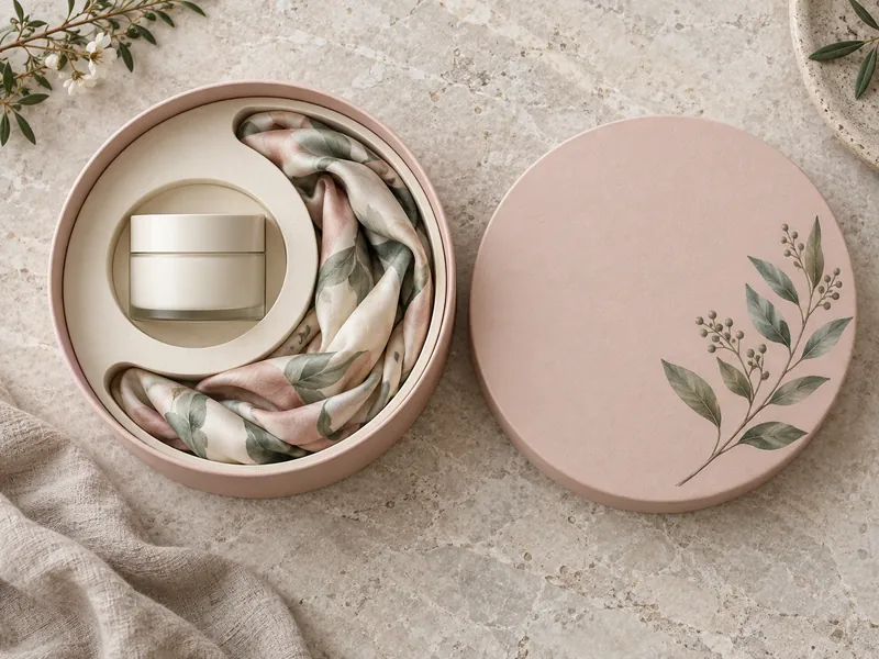
A jar and a soft accessory, for example, can create an asymmetric balance: the jar occupies a compact area while the fabric follows a broader curve. Several similarly sized items may suit a more regular arrangement. Neither approach is inherently more refined; the convincing choice explains the collection through its actual forms.
Leave a visible route for fingers beside the products and keep identifying labels exposed where practical. Decorative fullness can become counterproductive when the recipient cannot see where one item ends and another begins. Empty space can be an active part of both the composition and the handling experience.
Reveal a Familiar Detail in a New Scale
The inside does not need to repeat the exterior illustration in full. A small leaf on the guide, a lining color taken from the lid, or a restrained pattern beneath the products can provide continuity. One recognizable connection is often enough to make the opening feel considered.
Texture offers another connection that remains visible even without complex printing. Exploring wrapping materials for rigid boxes can help establish whether the design should feel smooth, softly textured, or more visibly paper-like. Keep the treatment compatible with the information and graphics that must remain legible.
Three Graphic Directions, Three Different Moods
Botanical Crescent
In this imagined concept, a branch curves along part of a cream lid, while a simplified leaf repeats on a sage sidewall. The interior uses the same sage only in a small accent. This direction suits a story where the illustration is the main expressive element and the product name needs a calm setting.
Architectural Rings
A second concept uses one fine circle and a short centered name, with a solid sidewall and a contrasting inner band. The precision of the few visible elements carries the identity. Adding multiple decorative finishes would risk weakening the clarity that makes this direction appealing.
Playful Orbit
A third concept places several small shapes around an off-center focal point, then repeats only one shape around the side. The interior can echo that movement through the product arrangement without becoming a literal diagram. Keep informational text in a stable area so the playful graphics do not dictate how someone must read.
Keep the Visual Idea Strong Across Every Angle
Finishing should reinforce the chosen focal point instead of competing with it. A limited embossed detail or a small reflective accent can distinguish the emblem, while a quieter surrounding surface preserves contrast. The techniques in common rigid box finishings offer ways to develop that hierarchy.
The clearest round gift box design has a recognizable idea from above, a coherent rhythm from the side, and a satisfying relationship between its contents when open. It does not need to display everything at every angle. Give each surface a job, repeat only the details that connect them, and let the circular form contribute to the story.